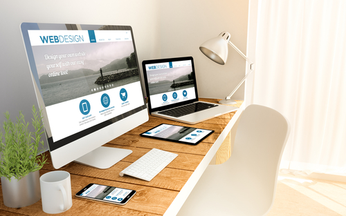
Responsive web design (RWD) is an approach to web design that ensures a website’s layout and content are optimized for viewing on any device, regardless of screen size or resolution. RWD has become increasingly important with the proliferation of smartphones and tablets, as it allows a website to adapt to these smaller screens and provide a seamless user experience. Here are 8 key characteristics of responsive web design:
Fluid grids:
In responsive design, the layout is created using a grid system that adjusts to the size of the screen. This allows the layout to remain consistent, even as the screen size changes.
Flexible images:
Images in a responsive design are also flexible, meaning they can scale up or down to fit the screen size. This ensures that images don’t appear stretched or distorted on smaller screens.
Media queries:
Media queries are a key component of responsive design, as they allow the website to detect the screen size and adjust the layout accordingly.
Responsive navigation:
A responsive design will also include a navigation system optimized for smaller screens, such as a drop-down menu or a hamburger menu.
Touch-screen optimization:
With the increasing popularity of touch-screen devices, it’s important to ensure that a website is optimized for this type of input. This includes larger buttons and links that are easy to tap with a finger.
Readability:
A responsive design should also prioritize readability, using a font size and line height that is comfortable to read on any screen size.
Load time:
A responsive design should also be optimized for fast load times, as slow loading times can lead to higher bounce rates.
Mobile-first approach:
Finally, a responsive design should take a mobile-first approach, meaning that it is designed with mobile devices in mind first, and then adapted for larger screens. This ensures that the design is optimized for the most popular device first.
In conclusion, responsive web design is an approach to design that ensures a website is optimized for viewing on any device. Key characteristics of responsive design include fluid grids, flexible images, media queries, responsive navigation, touch-screen optimization, readability, fast load times, and a mobile-first approach. By incorporating these characteristics, you can create a website that provides a seamless user experience on any device.

